In 2009, the film-maker Nancy Meyers was in an editing suite at Sony Pictures, fine-tuning the details of her next movie, It’s Complicated. That morning, her focus was the back garden of Jane, a successful Santa Barbara baker played by Meryl Streep. The garden included an extensive lawn, a swing-seat and a French-style potager garden, where Jane could wander about gathering ripe tomatoes in a fetching wicker basket. Meyers had already instructed an editor to erase dead trees and add a water feature, and now she was engaged in the process of smoothing out the yard’s remaining foliage. “Every plant that is spiky is removed from this movie,” was her instruction. “Keep it all soft.”
Meyers is one of the most commercially successful female film-makers in Hollywood, famed for productions such as Something’s Gotta Give, The Holiday and What Women Want, and the meticulous aesthetic of her films has long been part of their appeal. It includes throws and cushions and candles, books, cut flowers and high thread counts. She herself once noted how the look had been described as “the cashmere world of Nancy Meyers” – beige, unexceptional, and yet somehow endlessly coveted.
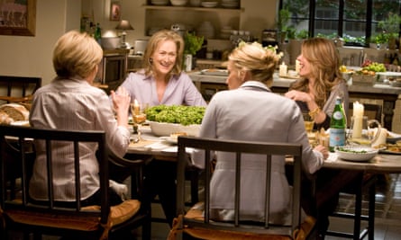
Meyers may not have made a film since 2015 but lately her aesthetic has enjoyed a flurry of attention. Earlier this year, the website Pinterest announced that “Nancy Meyers’ Interiors” was now its most-searched term. Home decorating magazines and social media posters duly devoted themselves to dissecting the look’s components, from the depth of the armchairs to the glow of the lamps. “Nancy Meyers’ Interiors” came in the wake of the popular TikTok term “Coastal Grandmother”. Coastal Grandmother was an approach to life as much as a fashion trend. It was Diane Keaton in Something’s Gotta Give, breezing through the Hamptons in white linen and bucket hat. It was white wine and lobster rolls, farmers’ markets and alfresco dining; a slow but vibrant aesthetic.
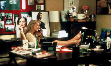
Although Meyers had a decade-long career by the time she made the Father of the Bride reboot in 1991, this was the film that established her trademark look. The home of the film’s central Banks family was a colonial-style house with a white picket fence, and an interior warmed by natural wood, cream walls and copper pans. It was a touch grander than the Vermont farmhouse of her previous film, Baby Boom, and its neutral colour palette was more pronounced. By 2000, and the Mel Gibson vehicle What Women Want, Meyers had begun working with Jon Hutman, who would become her longstanding production designer. The film contrasts the slick bachelor pad of perpetual womaniser Nick, with the light and warmth seen in the office of his new female boss, Darcy, played by Helen Hunt.

It would be Hutman, alongside set designer Beth Rubino, who would oversee the worlds of Something’s Gotta Give and It’s Complicated – two of Meyers’ most-loved interiors. Something’s Gotta Give, starring Diane Keaton and Jack Nicholson, had a budget of $80m and was set principally in the Hamptons home of Keaton’s character Erica Barry, a divorced fiftysomething playwright. The idea was “where does an educated, sophisticated, successful woman live?” Hutman has explained. He and Rubino focused on conveying a sense of air and light in the property, dressing the windows in linen, lighting the rooms with lanterns and candles and following Meyers’ request that viewers should feel “that sand is right outside the door”. Rubino set the mood by spritzing the air with suntan lotion before the actors arrived each day.
“There’s an air of privilege in how these spaces are designed,” says Dr Deborah Jermyn, associate professor in film at the University of Roehampton, and author of the Bloomsbury Companion to Nancy Meyers. “There’s plenty of space and light, and neutrals and whites and creams and beiges – just maintaining homes with that colour scheme speaks of privilege, because these are hard spaces to keep looking pristine.”
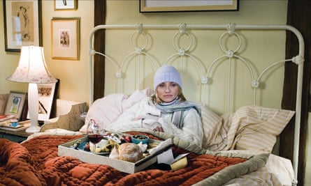
For Jermyn, one of the defining components of this privileged Meyersian space is bowls of fruit. “Fruit that will never be eaten,” she adds. “It doesn’t seem possible that they’re there for the purposes of consumption.” Rather, the fruit bowl is there to signify abundance and freshness, and to bring colour, shape and ripe texture. This last quality is particularly important, Jermyn says: Meyers’ sets usually have a haptic or tactile quality, “So there’s lots of comforting textures, and pillows and throws and lamps with warm light. They speak of comfort in two ways: physically, but also financially.” Over the years, the question has often been asked of where Meyers’ own taste ends and that of her characters begins. In her early days, the film-maker supplemented her writing career by starting a cheesecake business, and in her childhood home in Pennsylvania her mother renovated furniture she found at flea markets. It is also unsurprising to learn that when doing up her own home in California, Meyers doggedly pursued the perfect beige paint (eventually finding it in Australia).
Visit Meyers’ Instagram page today and one will be gripped by a certain sense of familiarity: cream walls, linen curtains, a straw hat and a lavender bush in bloom. One recent picture shows a vase of peonies, a selection of coffee table books and a deep armchair with a cashmere throw. Another offers two large candles in glass lanterns, and a glimpse of a softly topiaried yard. Beneath, her followers feast on every element, begging their hero to make another movie, telling of their deep love for her on-screen kitchens.

Meyers is fond of citing the film-maker François Truffaut: “Making movies is an accumulation of details.” Her reputation is as a film-maker who is similarly meticulous about every element of her sets. “When you read about how she prepares and her mise-en-scène, there’s this huge attention to her research, and wanting her sets to be authentic to her characters,” says Jermyn. “Famously, if she thought the thread count on the sheets was wrong she’d have to get rid of the bed linen. She describes having the wrong book on the bedside table as the same as someone writing in extra dialogue. It undermines the world of the characters that she’s really intricately designing.”
Such a fastidious approach to set detail is often lauded in other directors – the aesthetics of Wes Anderson and Tim Burton have even been celebrated in London exhibitions. But Meyers’ devotion to her sets has sometimes proved a source of disdain. “Reviewers have consistently been critical of this,” Jermyn says. “They’ve seen it as something that’s a bit of an annoyance in her films. The suggestion is it’s something she does because the characters aren’t that complex, or the story is predictable.”
Some criticism may hold, of course. The worlds she creates are invariably white, privileged, wealthy. But these are equally criticisms one might level at Anderson or Burton. “It’s really gendered,” says Jermyn. “It’s because these are domestic spaces, and because she’s making relationship films – romantic comedies if you want to call them that, and that kind of dramatic landscape is not taken seriously. So putting that amount of attention into your design in another kind of genre, a sci-fi or a war movie, is admirable. But doing it here just becomes like a woman fussing over details. It is clearly at odds with most of her audience, because this is one of the great pleasures of her films for them.”
The most recent Meyers revival coincides with an appetite for bland luxury – one need only think about the beigeness of the Kardashians, or of what the writer Kyle Chayka termed “AirSpace”, the “anaesthetised aesthetic” offered by the virtual realm of social media, where we all come to “see and feel and want the same things”, be they cosmetic procedures or interior design. It arrives, too, in tandem with trends such as “old money style” and “cottagecore”, which explore similar nuances of comfort and quiet luxury.

But we can go further back than current online trends. The favourable reaction to Meyers’ interiors also revives older questions of taste and aesthetics, particularly as explored in the 18th century by philosophers from Immanuel Kant to Francis Hutcheson, via David Hume’s A Treatise of Human Nature. Three hundred years ago we were, much like today, admiring the homes of the wealthy, considering why well-lit rooms and voluptuous blooms were so pleasing to the eye.
“One of the things that’s really interesting with Hume’s Treatise is that he introduces the term ‘sympathy’ to explain why we have esteem for the rich and the powerful,” says Neil Charles Saccamano, associate professor of English at Cornell University. “Hume talks about how the notion of property enters into why we esteem them – that they own things like houses and gardens.” The beauty of those objects, Saccamano says, is designed to produce pleasure in the owner of the object. “And we others, who do not own this property, and are not rich and powerful, and who are of a lower class, we simply ‘sympathise’ with the pleasure we anticipate that the owner of the property will receive from the objects,” he says.
So, when we watch Meryl Streep and Steve Martin making late-night chocolate croissants at her bakery in It’s Complicated, the sense of pleasure and anticipation we take from the scene is as much about “sympathising” with the luxuriousness of it all: the softly lit kitchen, the pastry against the cool marble counter, the exquisite indulgence of owning a bakery at all, let alone breaking in after hours for a little erotically charged patisserie-making. Much the same goes for the ample bookshelves and freshly cut flowers we see both on Meyers’ sets and in her home on Instagram. “And in Hulme’s analysis, part of the pleasure of the owner is knowing that others envy them – or sympathise with their pleasure,” says Saccamano.
But if we want a true forerunner to Meyers, Saccamano suggests we turn to Hume’s contemporary Edmund Burke, whose A Philosophical Enquiry into the Origin of Our Ideas of the Sublime and Beautiful addressed the tactile or “haptic quality of the aesthetic”. Most particularly, Burke coveted smoothness, a quality “so essential to beauty, that I do not now recollect anything beautiful that is not smooth”. In trees and flowers, he wrote, “smooth leaves are beautiful; smooth slopes of earth in gardens … and in several sorts of ornamental furniture, smooth and polished surfaces”. Or, as Meyers might put it: keep it all soft.
Source: theguardian.com


